Designing Best Buy’s Order History
Giving users access to their investment in Best Buy’s collection of products and services for their home
Challenge
Rapidly bring the core functionality of an Order History experience to the new mobile responsive site
This project was part of a rapid push to get the mobile responsive site online. Order History / Order Details was one of eight remaining projects required to launch the site. Order History was determined to be the top priority.
Role & Stakeholders
UX Practice Lead at Best Buy Canada
While my role was the Practice Lead for the whole UX team, I took on the role of an individual contributor for this initiative as the entire team was wrapped up in the various projects.
- Design team: UX Designer (myself), UI Designer, Copywriter
- Product team: Product Owner, Scrum Master, engineers, dev ops, and QA
- Stakeholders: Customer Service, Retail Operations, Delivery Logistics
- Users: Recent purchase users, Returns & Exchanges users, Users seeking product info
Goals for this Project
- Clarify a Vision as a trajectory for this feature
- Define a minimum feature set for Order History and Order Details
- Identify and measure the metrics that matter
- Deliver a measurable, ultra lean, iterative design
Approach
- Gather all known data – the existing information and reports with which people were currently operating
- Discover stakeholder assumptions – connect all stakeholders to align on expectations and targets
- Research customer needs – why are customers coming here, what do they need, what is working and what isn’t
- Set the Vision – more than just specifications, teams need a vision to allow them to all contribute to the design and development
- Define the architecture and interactions – building a framework for the design and planning the sequences of interactions within it
- Test the design – evaluating the success of the design through analytics and with real people
Gathering Data & Researching Needs
Heuristics and Analytics
Reviewing the data analytics that the Product Managers currently had and performing a UX Heuristic Analysis revealed several possible issues with the legacy system:
- Available actions not clear
- High abandon on Orders search results page
- Pathing problems
- Painful navigation causing users to call customer service
Customer Service Research
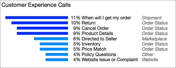
The call center volume for Order help was a significant company expense.
Call center volume turned out to be the key metric we chose to target.
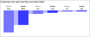
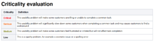
Customer Experience Call log data (below) showed the primary reasons customers were calling in.
- The top 4 problems customers called about represented 40% of all orders calls
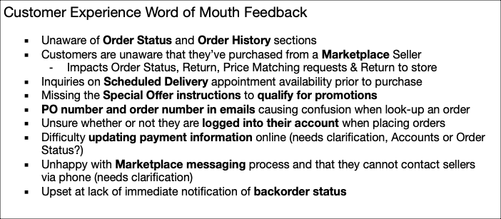
Customer Experience Agents’ Word of Mouth Feedback shared the biggest frustrations for customers and why they decided to call.
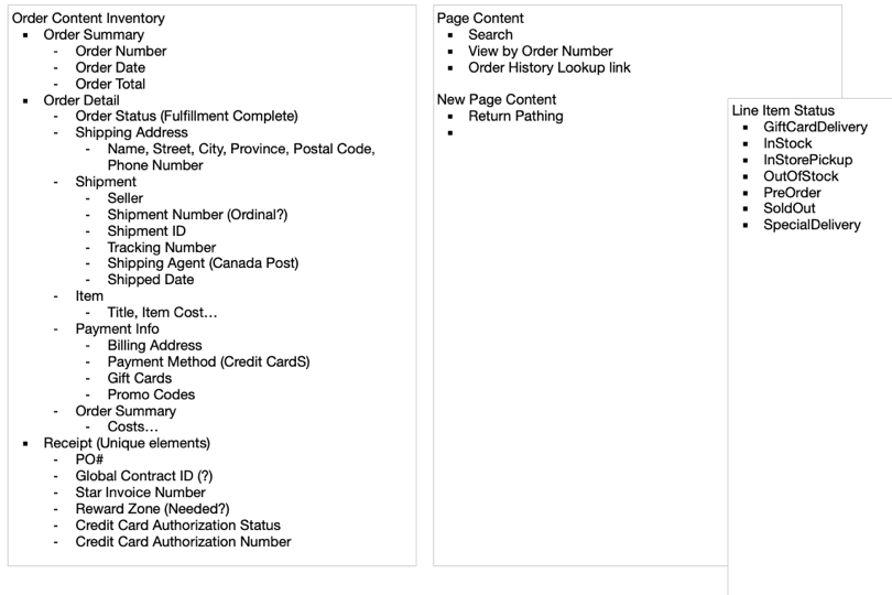
Content Inventory
A collection of the complete list of all the information points and interaction elements currently available or needed.
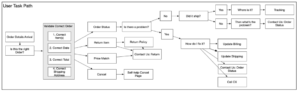
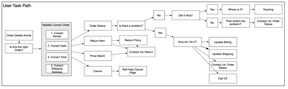
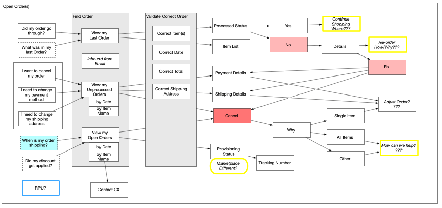
Process Flows
I starting with Customers intents to identify thought and action processes and clarify pain points and opportunities.

Goals Identified
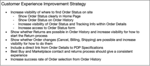
I wanted to align the team on goals and a vision for the work we were doing and to focus not on building just this project feature but on solving a set of customer needs with measurable outcomes.
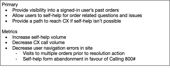
How we would achieve these was via a design strategy which defined some overarching objectives.

Vision
I defined a vision for this project that represents a north star that would not be completed in a few iterations, but rather a direction we should be moving toward. This can allow designers and developers to idenfity the correct frameworks and architectures to ensure long-term platform continuity.
Vision for Order History
- A Personal Concierge – all of their things in one place and recommendations related to what they already own
- Relationship Building – we are there when they need us and they know how to get what they want or to talk to us directly
- Customers Feel Invested – each time they visit our site or make a purchase they gain value above and beyond the product they purchased
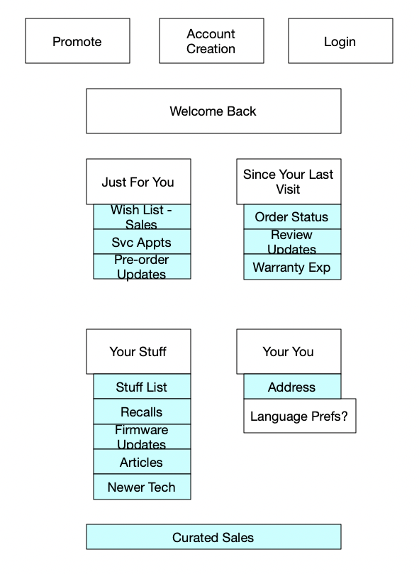
Customer Concierge Concept
Design
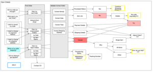
Information Architecture
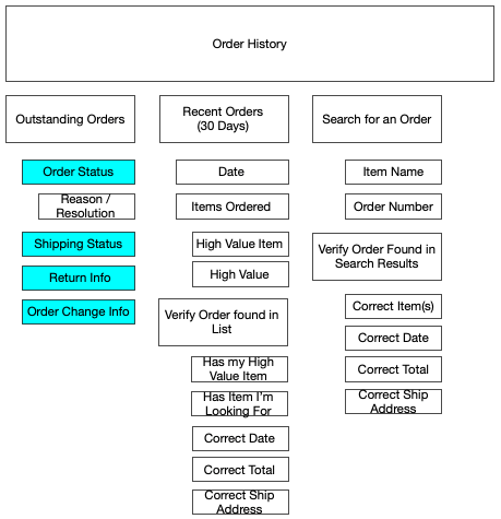
The information architecture starts by organizing the information in the priority of importance to the user before we proceed to organizing the page.
Wireframes
A shift from starting with the UI to doing Conceptual Design first
At Best Buy, UX and UI designers were separate roles. Initially UX designers were designing high fidelity mocks. My goal as UX Practice Lead was to shift the dynamic so that UX designers would provide conceptual, low-fi specifications and layouts. This would allow the UI designers, who were experts in the Design System, to choose the tools and components to meet those specifications.
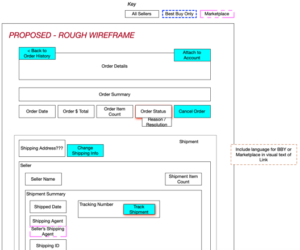
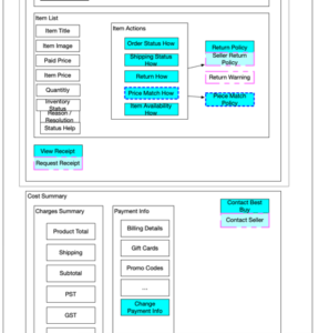
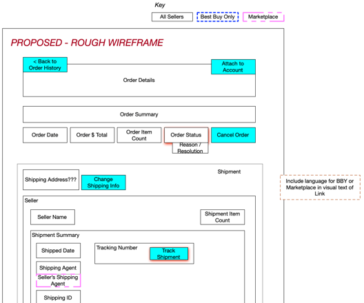
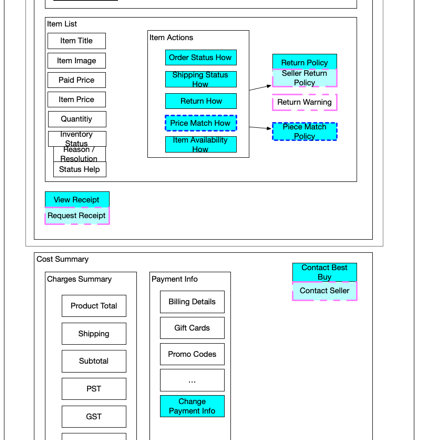
Early Conceptual Wireframe
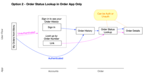
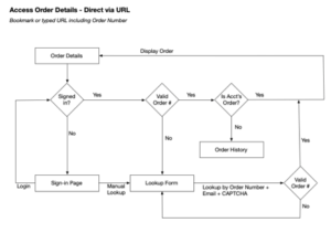
Authentication Workflow
Our legal team clarified what information could be availble publicly vs privately which allowed me to work with one of the engineer architects to define the order-of-operations for authentication and what information the customer would need to provide.


Evaluation
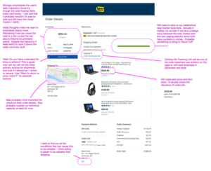
Design Reviews
Initial mocks from the UI designers were reviewed by myself and other stakeholders to provide quick, iterative feedback.

Usability Testing
We applied two different methods of user testing here:
- Remote unmoderated testing for quick spot checks of interactions and sequences
- On-site live testing for detailed feedback and Q&A
- Moderator / Observer model
- Observer had a coding sheet and recorded observational evidence
- Video and audio recordings of both the screen and the user
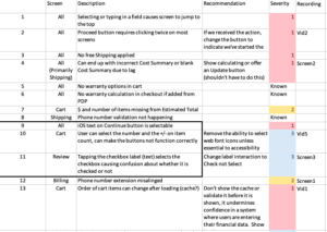
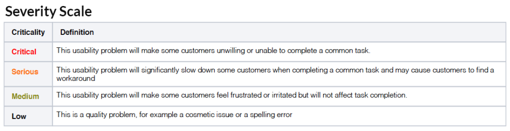
Evaluation Feedback
Results from the usability tests were organized by severity to be prioritized by the team and assigned to sprints.

Results
Easy access for customers and reduced call-ins
Overall this project was a resounding success, we achieved:
- Significantly reduced Customer Experience calls regarding Order Status and Returns
- Reduced bounce rate to the Contact Us page
- Improved tracking of when customers chose to call CX vs self-help
- Reduced multiple visits to Order History – customers were finding what they wanted the first time
- Lowered number of page visits in the Order History customer path – customers got to what they wanted quicker
This set of pages received several iterations toward the vision over the following years.
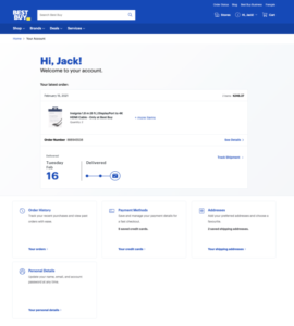
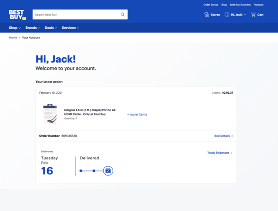
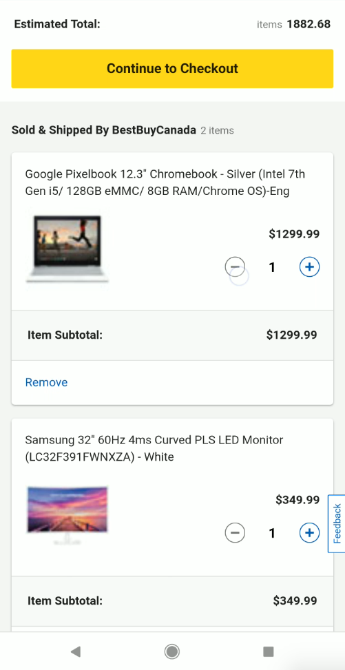
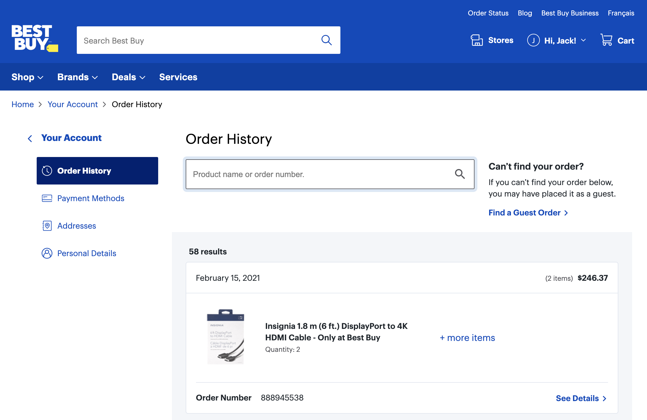
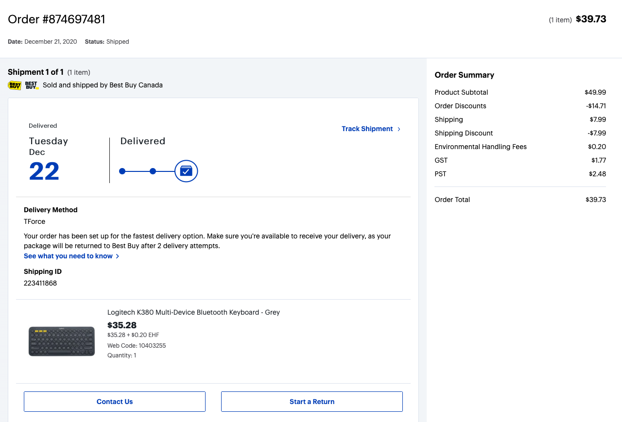
Final Screen Designs
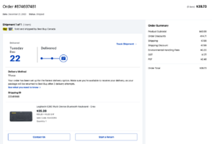
Order History
Order Detail
Account Concierge Screen

Lessons Learned & Take-aways
- Data set freshness for iterative feedback – some of the data we started with, particularly the customer experience log data, required significant effort to produce. This limited our ability to use that data to quickly evaluate success between iterations.
- Data points with more immediate accessibility should be set up in advance when it is difficult to get more robust data.
- Rapid delivery prevented a complete feature set – due to the nature of this project, a very limited feature set was initially completed to launch the mobile responsive site. Fortunately we made a strong case for the Vision for this project and key outcomes stayed high in the backlog for subsequent iterations.
- The key to ensuring essential design elements remained in the backlog were baseline tests done on the legacy site to compare against the new site – this demonstrated remaining gaps in the experience.
- The new method of conceptual wireframe hand-off to UI Designers stressed the current workflow – UI designers expected more complete high fidelity mockups and receiving low-fi wireframes caused tension and stress during this high pressure project.
- Ideally new work models should be introduced during pilot projects with lower pressure and rolled out with more clarity and intention.
Gallery
Images used in this page.